
A FinOps dashboard is a centralized interface that visualizes cloud financial data to support cost management, allocation, and optimization across multi-cloud environments. The term “FinOps dashboard” is widely used, but the formal discipline behind it is cloud financial management, as defined by the FinOps Foundation. These tools translate raw billing data from AWS, Azure, Google Cloud, and other providers into financial visibility that finance teams and business analysts can act on. Without them, cloud spend accumulates quietly, and the waste compounds before anyone notices.
What core metrics and KPIs should a FinOps dashboard display?
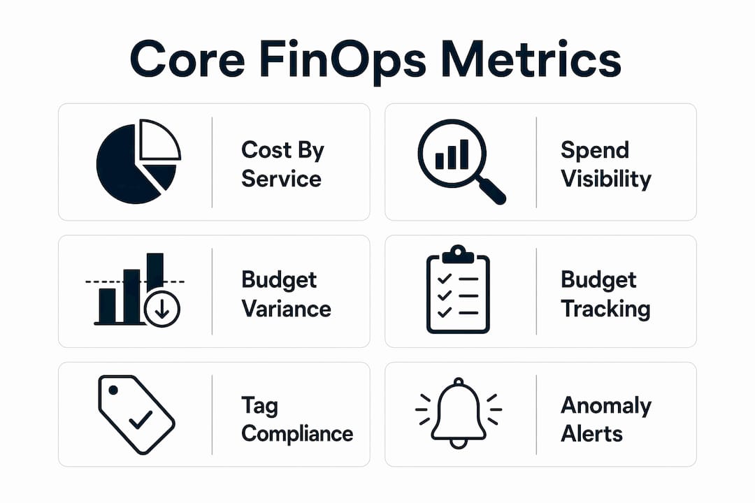
The most effective cost management dashboards surface three categories of data: spend visibility, budget compliance, and unit economics. Each category maps directly to the FinOps Foundation’s three operational pillars: Inform, Optimize, and Operate.
Spend visibility covers the basics every finance team needs first:
- Spend by cloud account, service, region, and project
- Daily and monthly cost trends with period-over-period comparisons
- Tag compliance rates and cost allocation accuracy
- Untagged or misallocated resources that distort reporting
Budget compliance metrics show whether teams are tracking to plan:
- Budget vs. actual spend at the account and team level
- Forecast vs. committed spend for Reserved Instances and Savings Plans
- Variance alerts when spend deviates from expected patterns
Unit economics are where dashboards create real business value. FinOps dashboards aggregate cost by account, service, and project, showing unit metrics such as cost per customer, cost per transaction, or cost per feature. These metrics connect cloud spend to business outcomes, which is what leadership actually wants to see.
Pro Tip: Build your unit economics metrics before your executives ask for them. Cost per customer is far more persuasive in a budget review than a raw AWS bill.

The metrics above align with the FOCUS specification, the FinOps Foundation’s open standard for normalizing cloud billing data. Dashboards built on FOCUS can compare costs across providers without manual reconciliation. That alone eliminates hours of spreadsheet work each month.
| Metric category | Example KPIs |
|---|---|
| Spend visibility | Cost by service, tag compliance rate, unallocated spend |
| Budget compliance | Budget vs. actual, forecast variance, commitment utilization |
| Unit economics | Cost per customer, cost per transaction, cost per deployment |
| Anomaly detection | Daily spend spikes, unusual service charges, new resource costs |
How do you architect FinOps dashboards for multi-cloud environments?
The data pipeline is the foundation. Professional-grade FinOps dashboards require custom ETL pipelines to normalize heterogeneous billing data across providers. AWS Cost & Usage Reports, Azure Cost Management exports, Google Cloud Billing Export, and OCI FOCUS reports each use different schemas, currencies, and granularity levels. A pipeline that cannot reconcile these differences produces misleading numbers.
Here is how a production-grade architecture typically works:
- Ingest billing data from each provider’s API on a daily or hourly schedule. Reliable data ingestion frequency is critical. Stale data means stale decisions.
- Normalize the data into a unified schema. PostgreSQL works well for this, with partitioning by date and provider to keep query performance fast at scale.
- Transform raw costs into business-aligned dimensions: team, product, environment, and cost center. This is where tagging rules and allocation logic live.
- Load the processed data into a visualization layer. Open-source projects use Python, Prometheus, Grafana, Slack, and GitHub Actions to build automated cost monitoring pipelines. Enterprise teams often add Power BI or Looker for finance-friendly reporting.
- Automate the full pipeline using CI/CD tools like GitHub Actions. Dashboards typically run daily at 08:00 UTC using CI/CD pipelines to deliver continuous monitoring and faster anomaly resolution.
- Alert on anomalies automatically. Slack notifications and Jira ticket creation keep the right people informed without manual triage.
Pro Tip: Schema migrations are the silent killer of FinOps pipelines. Version-control your database schema from day one. A provider billing format change should never break your dashboard.
The multi-cloud ingest and normalization layer is where most teams underestimate effort. AWS, Azure, and GCP each update their billing formats periodically. Your pipeline needs to handle those changes gracefully, or your cost reports will silently break. Build schema validation into every ingestion job.
What advanced features make FinOps dashboards more effective?
A basic dashboard shows you what happened. An advanced one tells you when something is wrong and routes the right people to fix it. The gap between those two capabilities is significant.
Automated anomaly detection is the most operationally valuable feature. Mature FinOps dashboards flag daily cloud spend increases over 20%, triggering Slack alerts and automated Jira incident tickets. That threshold is not arbitrary. A 20% daily spike typically signals a misconfiguration, a runaway job, or an unexpected scaling event. Catching it the same day limits the financial damage.
Anomaly detection methods combine statistical approaches such as rolling averages and standard deviations with machine learning models like Isolation Forest. The statistical layer catches obvious spikes. The ML layer catches subtle patterns that repeat over weeks. Together, they reduce false positives and surface the anomalies that matter.
Role-based dashboards are equally important for adoption. Effective FinOps dashboards use role-based views to give executives, finance teams, and engineering teams customized cost insights. An engineer needs resource-level detail. A CFO needs trend lines and budget variance. Showing both audiences the same view guarantees that neither gets what they need.
Additional features that separate good dashboards from great ones include:
- Budget forecasting with confidence intervals based on historical spend patterns
- Carbon footprint metrics integrated alongside cost data. Google Cloud’s FinOps hub integrates recommended optimizations, FinOps scores, and carbon footprint metrics into a single view.
- Governance and compliance tracking for tagging policies and access controls
- Scheduled reports delivered to stakeholders via email or Slack on a weekly cadence
- Integration with automated ticketing workflows so anomalies create actionable incidents without manual intervention
How do you apply FinOps dashboards for continuous cost optimization?
The dashboard is only as useful as the process built around it. Finance teams that treat their cost management dashboard as a reporting tool miss most of the value. The real benefit comes from using it as an operating system for cloud accountability.
FinOps dashboards enhance financial operations by visualizing chargeback and showback reporting, budget tracking, and anomaly alerts, all aligned to the Inform, Optimize, and Operate pillars. Chargeback assigns cloud costs to the teams that generate them. Showback shows teams their costs without billing them directly. Both approaches change behavior. Teams that see their own cloud bill spend less.
Pro Tip: Start with showback before moving to chargeback. Teams need time to trust the data before they accept financial accountability for it. Rushing to chargeback creates resistance, not ownership.
Practical steps for driving continuous optimization through your dashboard:
- Review anomaly alerts daily and assign ownership within 24 hours
- Run a weekly budget variance review with engineering leads
- Track tag compliance as a KPI and set a minimum threshold, such as 95% of spend tagged
- Use unit economics trends to identify services where cost is growing faster than usage
- Align dashboard review cycles with your FinOps lifecycle stage: Crawl, Walk, or Run
Cross-team collaboration is where dashboards pay for themselves. When finance and engineering share the same cost data in real time, conversations shift from blame to problem-solving. The dashboard becomes the shared language. You can find additional FinOps best practices and design guidance for teams building or refining their reporting infrastructure.
Key Takeaways
Effective FinOps dashboards require unified data pipelines, automated anomaly detection, and role-based views to drive real cost accountability across finance and engineering teams.
| Point | Details |
|---|---|
| Start with the right metrics | Track spend by account, tag compliance, budget variance, and unit economics from day one. |
| Build a normalized data pipeline | ETL pipelines must reconcile AWS, Azure, GCP, and OCI billing schemas before any visualization is useful. |
| Automate anomaly detection | Flag daily spend spikes over 20% and route alerts to Slack and Jira automatically. |
| Use role-based views | Finance, engineering, and leadership each need different data cuts from the same underlying model. |
| Tie dashboards to process | Chargeback, showback, and weekly reviews turn dashboard data into cost-saving behavior. |
What I’ve learned building FinOps dashboards at scale
The biggest mistake I see teams make is treating the dashboard as a one-time build. They spend weeks getting the pipeline right, launch a beautiful Grafana or Power BI interface, and then stop. Six months later, the data is stale, the tags are a mess, and nobody trusts the numbers.
The second mistake is underestimating data normalization. Every time a cloud provider updates their billing format, something breaks. I’ve seen teams lose weeks of cost history because nobody versioned the schema. That is not a technical problem. It is a process problem.
What actually works is treating the dashboard like a product. It has owners, a release cadence, and a feedback loop. Engineering teams should be able to request new dimensions. Finance should be able to flag when numbers don’t match their expectations. That feedback loop is what keeps the data trustworthy.
Anomaly detection is the feature that earns the most trust, fastest. When a dashboard catches a $40,000 runaway job at 8:00 AM instead of at month-end, people start paying attention. That one catch often justifies the entire FinOps program in the eyes of leadership.
The teams that get the most value from their dashboards are the ones that connect cost data to business outcomes. Cost per customer. Cost per deployment. Cost per API call. Those numbers make cloud spend legible to people who don’t live in AWS consoles. That translation is the real job of a FinOps dashboard.
You can explore enterprise FinOps practices and see how organizations at different maturity levels structure their reporting and governance programs.
— Dan
Everythingcloud’s FinOps platform for enterprise and MSP teams
Everythingcloud delivers real-time visibility into AWS, Azure, Google Cloud, SaaS, and AI spending through a platform built for finance teams and MSPs who need more than a static report.
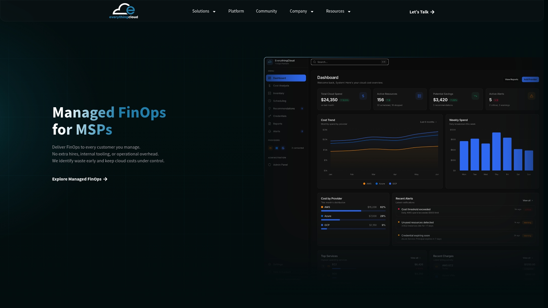
The platform provides automated anomaly detection, multi-cloud cost normalization, and role-based dashboards without requiring you to build and maintain the underlying data infrastructure. For MSPs, the managed FinOps service provides a turnkey solution that includes expert recommendations, 24/7 monitoring, and the reporting tools your clients expect. For enterprise teams, the enterprise FinOps platform integrates with your existing cloud accounts and delivers the financial visibility and governance controls that mid-market and large organizations need to manage spend at scale.
FAQ
What is a FinOps dashboard?
A FinOps dashboard is a centralized reporting interface that visualizes cloud spending, budget compliance, and cost allocation data across one or more cloud providers. It supports the FinOps Foundation’s Inform, Optimize, and Operate pillars by giving finance and engineering teams shared visibility into cloud costs.
What metrics should a FinOps dashboard include?
The core metrics are spend by account and service, budget vs. actual variance, tag compliance rate, anomaly alerts, and unit economics such as cost per customer. These metrics align with the FOCUS specification for normalized cloud billing data.
How does anomaly detection work in FinOps dashboards?
Anomaly detection combines statistical methods like rolling averages with machine learning models such as Isolation Forest to flag unusual spend patterns. Mature implementations trigger automated Slack alerts and Jira tickets when daily spend increases exceed 20%.
What is the difference between chargeback and showback in FinOps?
Showback reports cloud costs to the teams that generate them without billing them directly. Chargeback assigns those costs as actual financial charges. Showback is typically the first step, used to build trust in the data before financial accountability is enforced.
How do you normalize multi-cloud billing data for a dashboard?
Normalization requires ETL pipelines that ingest billing exports from AWS Cost & Usage Reports, Azure Cost Management, Google Cloud Billing Export, and OCI FOCUS reports, then map them to a unified schema. The FinOps Foundation’s FOCUS specification provides an open standard for this normalization process.